Thursday, December 11, 2008
Film vs Digital
Film versus digital, is the digital era finally proving itself?
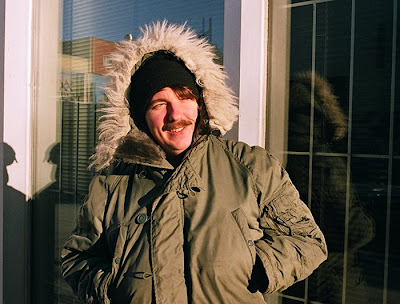
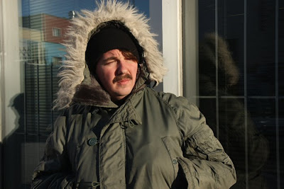
This assignment was very interesting to me. I have been letting my 35mm film camera behind when going out to shoot since I first got my hands on my digital SLR. I thought for sure that the technology of the newest digital cameras could, without a doubt, overpass the image quality of the classic film camera. But this exercise changed my mind.
1. Color. In all scenes the film captured more colors than the digital camera did. In the example posted here, the skin looks way more alive in the first image, there are different colors on the face , red and pinks and suchs, creating an image that is way more rich and real looking. In the digital picture everything looks desaturated and flat. Film wins.
2.General Contrast. Contrast seem to be quite equal in all images. There is a good difference between the darks and the brights. I would say that film equals digital in this category.
3.Latitude. Once again, I would say that film does a better job at capturing the tonal range in the overall of the images. There are more visible details to be seen in the highlights and the shadows appear to have more depth to them.
4.Sharpness. I don't know if my pictures were sharpened in the lab, but I can see that the 35 mm pictures are sharper than the ones taken with my digital camera. I thought that digital images were supposed to be sharper.
5.Resolution and Fine Detail. The cd that the lab gave me contained image at 72 ppi resolution but I know that film grain is a thousand times sharper than that. But already at 72 you can see that the image that came from the film negative contains details that are more visible. Just look at the furry collar on the winter coat.
6. Atmosphere. I think film images are richer in color and contrast and that they contain a finer resolution in details. I find that the film has some kind of warmer feeling. The digital images appear so flat and desaturated in comparaison to film but I think that can also be an interesting look.
After doing this exercise I realize that film still captures more visual information than the digital process can. The pictures look more vivid and real and the details are sharper. Film also seem always to capture life in a unique way, it is probably because we have grown up looking at images taken with film cameras and our memory of the images just makes it more real for us now, but there is a big difference. Enough for me that I will start carrying my film camera with me again when I go on shootings.
Wednesday, December 10, 2008
the late cyanotype
Here's the cyanotype picture that I created at the beginning of the semester. The objects I used are part of the dozens of little treasures that I have exposed all over my bedroom. The most visible are two little toy guns. It was a good experience to learn this process that was previously totally unknown to me. I just wished that there was other color possible since blue is my least favorite color.
What we did was pretty simple. Dave mixed the substance that we were going to use (Ferric Amonium Citrate and Potassium Ferrycyanide), I remember that he had to be real careful since some of the elements were highly toxic. Once the sunlight sensitive substance was mixed, we coated one side of the paper with a thick equal layer, making sure not to put any around the edges of the paper, to give it some kind of frame. Once the substance dried up it looked yellow\ green. Now it was time to take it outside to have it exposed to the sun's ultra-violet rays.
When the sunlight hit the paper, the areas that were not covered by the objects turned into more of a gray color. Everywhere you could see the green vanish. This took around 8 minutes. As soon as the exposure was done, we took the paper back inside and washed it in water to remove the active part of the substance. The areas that were not covered by objects turned into a blue color, and the ares of the paper that were under the objects took a very light blue color, almost white.
I am quite happy with the result, it is amazing how the most beautiful things can be so simple sometimes. I would like to do this on my own in the future, maybe try with bigger surfaces or even on clothes, but the fact that some of this stuff is highly poisonous is kind of holding me back.
Wednesday, November 19, 2008
Bitter Harvest, the media is the message
In the picture of the woman with the two children, the media chosen, black and white, serves to strongly support the feeling of desolation and hopelessness captured in the image. The empty dish, the lack of a father figure and the makeshift tent are also a great help in demonstrating the hard times these people are going through. Also, the angle that the photographer decided to use seems to be the one of a person looking with pity at the suffering and pain that his subjects are living.
In the second picture, the color media brings an impression of hope and life to the image. Even though the sky is really dark and cloudy, the sun still shines and the man and the woman seem to be looking ahead, into the future, into better times. They stand together with a confident look, like they are saying "these are hard times , but we will get through them". By shooting the picture at this angle, the photographer makes us looks at his subjects like they are on a podium, like they are heroes. But the same picture taken with black and white film would have not had the same hopeful impact.
Monday, November 3, 2008
Joyce Tenneson vs the Pictorialists
Do I see a relationship between the work of Joyce Tenneson and the pictorialists photographers?
Yes I do. Joyce's pictures have that "soft glow" quality that is found in the pictorialists work. Her usage of sepia tones, soft focus and just the overall look of her works certainly remind me of Gertrude Kasebier's work. The feeling of the pictures is also very similar, the calm and beauty of woman resting, the certain look of peace and quiet that emanates from them is also another reminder of the pictorialism work that I have seen.
Gertrude and the dots : a critique on pictorialism
This is a portrait of a young woman done by the photographer Gertrude Kasebier. The technique used here is pictorialism. The image has a sepia tone and the subject is sitting on a big chair, looking softly at the photographer, holding a little creamer.
I believe that the photographer used the pictorialism technique in this picture so that the image would resemble a painting and therefore, could be looked at more as a piece of art than as a picture alone. The beautiful softness of the image is also due to the technique used in the creation of the portrait. When I look at this image I can really embrace the beauty of the woman, the softness of the image also adds a lot to the feeling of the picture, of the emotion that comes from her eyes.
I am amazed at how sharp the woman appears. All the little details on her dress and hair, are just really beautiful. The way the photographer interacted with the subject probably had lots to do in the resulting image. If the photographer wanted to create a vision of happiness, calm and motherly love, then I can say that he was successful without any second thoughts.
Big Ideas, Large Format
Ah! the large format! This assignment was one I was waiting to do since the beginning of the year. I had used a large format camera in the past, my step dad owns a even larger one, a 8x10 I think, and I always wanted to learn more about them and mostly, take more pictures using the technology.
My and my partner for the assignment tried different types of picture. We tried to a city scape and for that we even played with the controls on the side of the cameras to make the "accordeon" part change from a straight angle to a slightly curved one. The results did not really show that the angle had been changed, and the pictures were overexposed so I did not decide to post any of those images.
The ones I am showing here are by far my favorite. In the first image I wanted to show the moving traffic on each side of me while I was standing still. Since it was a bright sunny day , the moving cars did not leave much of a mark on the images, but still, the result is quite nice, if you look carefully you can even see the ghostly prints left by the moving cars. The other picture I have here, "Matte with a stick", really amazed me when I first saw it in the dark room. I had wanted to create a ghost portrait of myself, which is kind of going with a theme I have been digging into in my personal work, and the results are just better than I expected. What I did was quite simple. We took a long exposure with a very small aperture and I left the frame for a third of the exposure time, right in the middle. The results are beyond what I had planned for. I am really happy with it.
Monday, October 20, 2008
La beach chez mon'oncle
What I first see in this picture is all those little groups of people and how similar all of the people appear in their uniform-like bathing suits. I like the overall feeling of the picture, how the people appear so young and full of life in an era where life was so much more simple, the way the light shines down on them from everywhere at once brings an impression of a reassuring calming presence , the calm shallow water adding a feeling of security and good life, the big wide open sky full of promises.
The skies seem to be a bit over exposed, but I guess it was the only way to get a good exposure on the people and to be able to get good details on their clothes and faces. There is a good range of tones present in this print, the darks are really dark and there is a wide selection of mid tones all the way to the almost white of the sky. The point of focus is on the two girls but it also floats around nicely on the people sitting down and the couple getting out of the water. This picture was probably taken at a aperture of somewhere 5.6 or less since the focus does not travel far behind the subjects who are in focus.
I would hang this picture in my bedroom because looking at it does not get tiring at all. The peacefulness of the people's face is beautiful and this beach is made to turn into some kind of paradise.
This is a self portrait that I took with my pinhole camera. I am standing in a phone booth and my exposure is of about 2 minutes and 30 seconds. Because of a slight attention deficit disorder, it is impossible for me to stand still for that long, therefore, during the exposure I moved quite a bit, lighting a cigarette and talking and laughing with Gab.
I made this camera with a really wide angle especially to enhance the look of portraits. The camera really blows for landscape type of pictures or anything with a far subjects, but for portraits and close-ups it works quite well. I used a piece of paper (negative) of 4 X 5 inches which also helps by creating a nice natural frame to the pictures.
I love how sharp the background is sharp in correlation with the subject (foreground), I was going for a ghostly image of myself, I think I got what I bargained for.
Thursday, October 9, 2008
Wednesday, October 8, 2008
Johnny's got a new gun
Tuesday, October 7, 2008
The secret life of a pinhole
Cowboy tintype or when the modern day cowboys meet the 19th century photographer
This tintype picture is a group portrait of 5 cowboys, the real kind of cowboys. The men are lined up against a wall wearing the classic cowboy attire and they have quite the serious look on their faces. The way that these men are photographed really represents the image of what cowboys are. Hard working men with no frills, dressed in clothes that are durable and practical in the same style that cowboys have been wearing for hundreds of years, standing straight and solid and looking right ahead.
The picture was most likely taken on an overcast day. There is barely any shadow on the wall behind the cowboys or on their faces from the hats. I think that a flash was probably used or some kind of light that was aimed directly at the subjects, but most likely a flash. In this image we can see a range of tones but the contrast is pretty low. The dark areas, like the horse, are almost black but the shirts that are probably white in real life appear to be a creamy gray on the picture. There is very little details in the image, especially in the darker areas and that is most likely due to the technology used to make the image.
To me this image is really interesting. There is more than a portrait of 5 cowboys with a horse in the image. The fact that the technology used to make the image is almost as old as the cowboy occupation itself gives this picture a bigger, more meaningful impact. If it wasn't for the sunglasses that one men is wearing there would be very little clues that this picture was taken in the 21st century. By using the tintype technique , the photographers emphasize on the historical side of the cowboy occupation and how little things have changed since the 19th century.
Monday, September 8, 2008
Pinhole critique
1.This is a grayscale image of a church main entrance with tall columns, a double door and the way the picture was taken you can see from the bottom of the door to all the way to the top end of the columns.
2.I believe the intention of the photographer was to capture the immensity of the building by intensifying the sensation of how small one person is vis-a-vis a building of such grandeur.
3.I strongly feel that this picture is really successful into capturing the beauty of the church, the angle of the photograph is perfect, the wide angle feel of it is exactly what makes this picture remarkable
4.This picture really works for me because it does brings me right there, at the foot of the stairs leading to that big door. The photographer is showing me a view that is almost better that if I was there, looking at the building with my own eyes.
Tuesday, August 26, 2008
sleepless lundi soir
Monday, August 25, 2008
Subscribe to:
Posts (Atom)